
Image

I know what you are thinking. We have heard it 1000s of times.
"We want something cool, like a video background on the homepage of our website." Or, "Can we have a moving image slider at the top of the page so we can display all our offerings?"
I have to admit, some of the videos I have seen are pretty cool. But with our mission of turning skeptical website visitor into qualified leads for our gym owners I have to take a bit of a different look at the effectiveness of these design elements.
Conversion rate experts Tim Ash and Peep Laja did exhaustive split testing across many industries to find out if these "cool" features moved the needle when it comes to conversions.
What they found was almost all sites that use moving image sliders or video backgrounds above the fold on the homepage actually LOST sales because of them!
I don't know or work with any gym owner that can afford to LOSE sales.
Let me explain to you the WHY behind the psychology and provide ways for you to avoid these conversion-killers and start turning more skeptical website visitors into qualified leads.
What is a moving image slider?

Image sliders, carousels, or slide shows are a series of fixed images put together in a sequence. No matter the name, these will kill your conversions.
The following two case studies on sliding banners and banner blindness prove the point.
Notre Dame Web Design Case Study
Summary: Best practice web design should not use an automatic image slider.
Banner Blindness - Nielsen Norman Group
Summary: The user's target was at the top of the page in 98-point font. But she failed to find it because the panel auto-rotated instead of staying still.
Yoast put together an article on sliders recently and the title tells you all you need to know: "Sliders suck and should be banned from your website". Here are the bullet points:
- Only 1% of people actually click on a slider, which almost always was the first slide;
- Sliders confuse people, as you’re sending multiple offers they may or may not be interested in at once;
- People simply ignore your slider, because it triggers banner blindness;
- On that same note, visitors just don’t get the message because they will skip the messages in your slider as they consider it advertisement or promotions;
- They slow down your site, negatively impacting your SEO and conversion rate;
- Sliders don’t always work well on mobile devices;
- They push down your content, which is not smart, as Google already mentioned in 2012;
- It’s most probably as effective to use just one image instead of putting all that effort in slider plugins and images.
What about video backgrounds?
The video is cool, yes. But here is why we don't recommend video backgrounds:
They kill conversions:
- Video backgrounds slow down page loading.
- Video backgrounds send away mobile users because the video eats up mobile data.
- Video backgrounds distract from your call-to-action (CTA) as a moving video clip draws attention to itself instead of your CTA.
Unlike image sliders, there’s not much room for compromise with a video background. If you want to maximize conversions – don’t use one.
Are there any other reasons to avoid these conversion-killers?
There’s been a lot of research into how people REALLY use web pages, and some of the key findings include:
- Unexpected movement is a distraction…
- Movement that people can’t control is an irritant…
- Text that moves when they’re trying to read is irritating…
People “scan read” a website the way they flip through a newspaper or magazine, so:
- Text that’s hard to scan and understand quickly is an irritant…
- Things that INTERRUPT their ability to scan are an irritant…
- If they can’t scan it, they don’t see it (why only your first slide gets read)
The reality for both practices is:
- Video and slider backgrounds both slow down your website.
- If your website is slow to load, Google doesn’t like you anymore than your visitors.
- Both video and slider backgrounds send away mobile users because they eat through mobile data.
- Video and slider backgrounds distract from your call-to-action (CTA).
Alternative Solutions
- Keep your call-to-action options streamlined. One option is best (K.I.S.S) no matter how many offerings you may have. By using a single entry-point for conversions and logical forms a visitor can self-qualify themselves. This eliminates the need for a hero image slider.
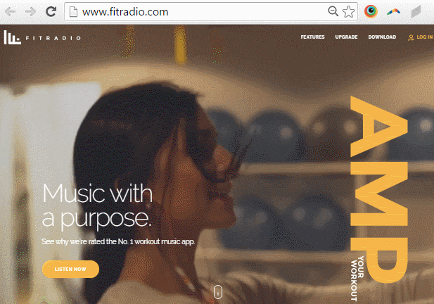
- Have a static hero image that is optimized for web usage that looks great and speaks to your brand hero.
- If you have a video that you absolutely want to use we can add them in other places and optimize the page loading sequence to improve performance. But the visitor will be in control of whether it will be viewed or not.
Takeaways
A good fitness website is not just about making a great first impression; it’s also about communicating your unique story, being a solution, and achieving your goal (i.e. conversion).
And if you want to do this effectively, image sliders and video backgrounds are a big “fail”.
Instead, seek design solutions that offer the benefits of image sliders and video backgrounds, but without their downsides.